Dog For Hire: Process

Here’s some insight in the process of creating one of these digital collage comics:
Content


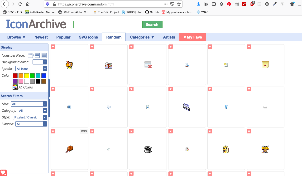
These were the pieces that I chopped up for this. I looked at a lot of other things but these wanted to coalesce together in my mind. I allow this stage of the process to be open. I save the images to my desktop and then drag them into the canvas once I’ve laid in a grid.
I use the Icon Archive’s classic pixel art icons as a source of inspiration. It’s like opening up a magazine to a random page and cutting out what I find. Their archive structure makes this useful. Sometimes I find a flower I like and then pop into the collection that flower comes from to see what other icon’s the creator of that icon might have made.
Form
I usually start these comics solely with a desire to make something. Sometimes I have a direction in mind. I usually find myself using that as a place to start but veer away from that idea or sentiment fairly quickly. I tend to follow my intuition of what makes the pieces come together. Here’s a look at some of the early cut and pasting and rearranging looked like.


The first step was the laying out of an underlying grid. I don’t always do this, but it was something I wanted to work on in this case. I’ve been really interested in underlying grids determining higher order structure relationships. Tight, but invisible. (I look forward to making 15 panel grid pages in the future. That grid is a brutally beautiful thing).
As you can see, in this piece I was especially committed to the overall structure, particularly the inlaid 9 panel grids within panels 2 and 3. I thought it to be an interesting formal constraint and I found that there was a fertile tension in the layout.
Color
To achieve the coloring technique that I’ve used as the unifying element for this series, I use Photoshop’s Save For Web feature. It’s usually used to compress files with fine control of format and compression artifacts. In my usual way, I looked at this tool that was built with a certain use case: optimal compression with controlled lossy-ness, and thought tried to think of it in another way. What would it yield if the goal was to intentionally change the image significantly?
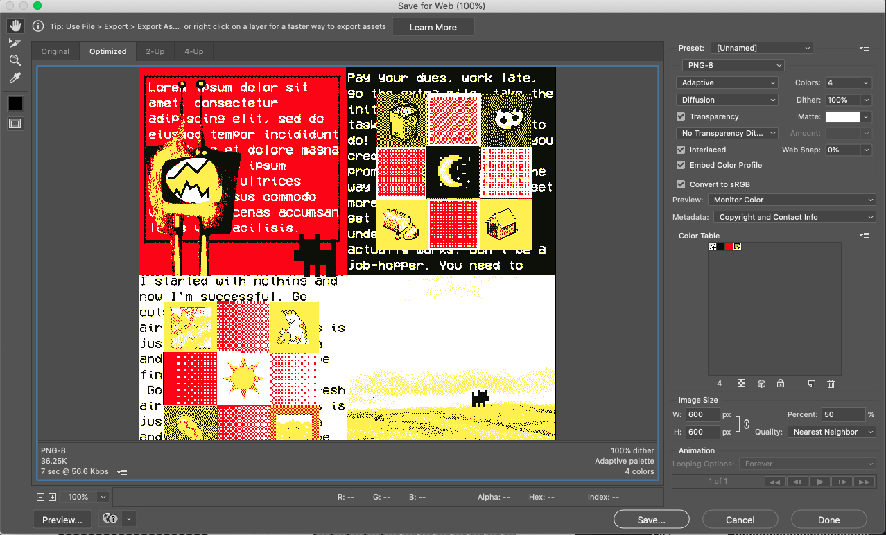
I started following this train of thought a couple years ago. I’ve found that it creates a really neat back and forth in the process, akin to screen printing, where the output based on the input started to effect the decisions I would make in the input. I’ve sought to become in tune, intuitively, with the variables involved in the color decision and dithering algorithm.
Some high level take-aways: Gradients dither really nicely, for example. Garish colors in an original image, assuming they have solid contrast, yield coherent new images. Organic mark making techniques yield surprising textures. Pixel art’s sharp edges yield a satisfying textural contrast to the complext dithering that happens, etc.
In short, this process creates richly textured digital images that I think of as screen printed collages. It’s a good space to step into when I want to communicate something but don’t know exactly what.
Trial and error, constraint and composition, chaos and accident.
    🎶 Currently listening to:

    Toro y Moi  - Outer Peace